The Power of Fonts in Branding: How Typography Shapes Perception

In the diverse universe of design, typography often stands as a silent hero—subtly conveying moods, values, and personality without uttering a single word. Fonts are much more than aesthetic choices; they are decision-making tools that brands use to communicate who they are and what they stand for.
A font can either beckon or repel, comfort or challenge, whisper or shout. So, if you plan on creating a Zoom background in https://create.vista.com/create/zoom-virtual-background/ to make sure your branding is consistent in online meetings then stick around. This article delves deep into the power of fonts in branding, illuminating how they shape perception and the way consumers connect with a brand.
Fonts as Brand Ambassadors
Imagine walking into a luxury boutique and being greeted by a store assistant wearing a casual t-shirt and flip-flops. It feels discordant, right? That’s precisely the kind of dissonance an inappropriate font can introduce to a brand’s identity. Fonts serve as a brand’s attire, signaling to consumers what they can expect.
The curvaceous elegance of the Coca-Cola script font or the simplicity and directness of Apple’s San Francisco typeface are not mere design whims. These fonts have been meticulously chosen to mirror the brand’s essence, encapsulating its core values and philosophy.
Brands like Disney, with its whimsical and recognizable script, have successfully used fonts to capture the spirit of magic and imagination. The font itself, independent of any other branding elements, already begins telling the Disney story. On the other end of the spectrum, luxury brands such as Tiffany & Co. or Vogue use sleek, sophisticated fonts that exude an air of exclusivity and prestige.
Crafting a Mood with Typography
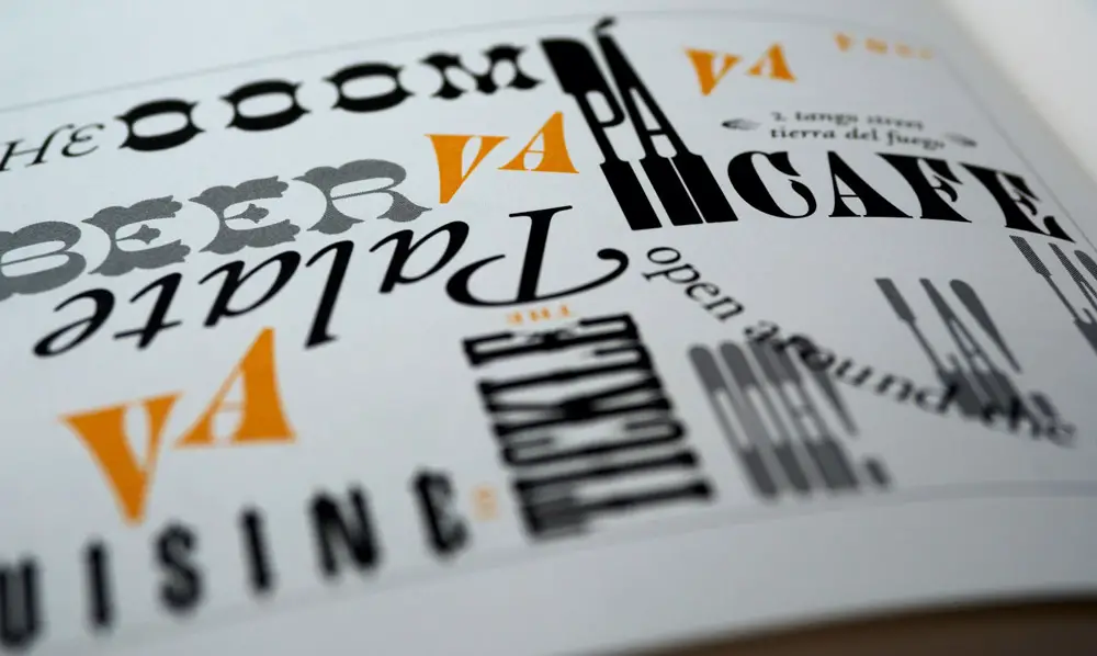
Every font carries with it a universe of emotions. Serif fonts, characterized by their tiny “feet” or lines attached to the end of a letter stroke, often come across as traditional, respectable, and reliable. They evoke an old-world charm, suggesting a brand steeped in tradition and history. That’s why many newspapers, universities, and legal institutions tend to lean towards them.
Sans-serif fonts, devoid of these extensions, are seen as modern, clean, and approachable. They’re the choice of many tech companies and startups aiming to appear innovative and forward-thinking.
Meanwhile, script fonts, which imitate handwriting, carry a personal touch. They can be elegant or casual, making them versatile for various brands aiming for a more human connection.
Choosing the right font means aligning it with the mood a brand wants to establish, ensuring that it resonates with its target audience’s expectations and preferences.
Brand Consistency and Recognition
Once a brand settles on a font that encapsulates its essence, consistency becomes paramount. Fonts play a pivotal role in making a brand instantly recognizable across various platforms and touchpoints. When Nike uses its bold, capitalized typeface, or when Google employs its colorful, playful logo font, they’re reinforcing brand recall, ensuring they remain top-of-mind for consumers.
This consistent use of typography, paired with other design elements, results in a robust visual identity, making brands memorable. It’s not just about looking good; it’s about etching a brand’s image into the consumer psyche, making it synonymous with specific values, qualities, and experiences.
Enhancing Readability and User Experience
Beyond aesthetics and emotions, practicality plays a crucial role in font selection, especially in the digital realm. As brands increasingly vie for consumer attention online, ensuring content is easily readable across various devices and screen sizes becomes imperative. Fonts that are clear, scalable, and legible contribute to a positive user experience, reducing bounce rates and increasing engagement.
Adapting to Cultural and Global Contexts
In today’s globalized market, brands often cater to diverse audiences spread across different regions and cultures. Typography, laden with cultural connotations, needs to be chosen with sensitivity. What resonates in one culture might not have the same effect in another.
For instance, while minimalist fonts might be favored in certain Western contexts for their modern appeal, in other cultures, they might come across as impersonal or lacking warmth. By understanding the cultural semantics of typography, brands can tailor their visual language to resonate more deeply with different demographics.
In Summation
Fonts are more than just letters on a screen or paper. They’re strategic tools brands wield to craft perceptions, forge emotional connections, and offer memorable experiences. In a world saturated with content and stimuli, thoughtful typography can be the distinguishing factor that sets a brand apart.